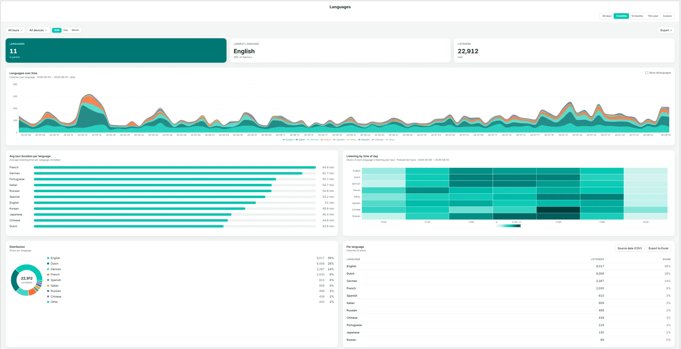
The Languages page gives you a focused view of which languages your visitors listen in, and how that mix is trending over time — the detail behind findings such as a language growing in share, as surfaced on the Overzicht pagina.
Key Metrics
Languages — the number of distinct languages used during the period.
Largest language — the single largest language by listener share, with its percentage.
Listeners — total listeners in the current selection.
Languages Over Time
A stacked area chart of listeners by language across the date range. By default, smaller languages are grouped together; select Show all languages to display every language individually.
Avg Tour Duration Per Language
A bar chart ranking languages by average time spent. Notable differences here can indicate translation or narration-pacing issues — for example, if one language runs noticeably longer or shorter than the rest, it may be worth reviewing that recording.
Listening by Time of Day
A heatmap showing each language’s share of listening by hour, useful for identifying whether evening visitors, for instance, skew toward a different language mix than daytime visitors.
Distribution
A donut chart breakdown of listener share by language.
Per Language Table
Listeners and share for every language, with Source data (CSV) en Export to Excel options.
If a language’s share is growing, use the Tours page to check whether that growth is concentrated in one tour or spread across your whole catalog before deciding where to expand coverage.
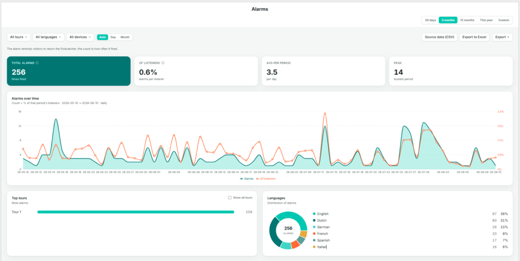
The Alarms page tracks the “return the Podcatcher” reminder alarm — how often it fires, and for what share of listeners. This is primarily an operations and hardware-recovery metric rather than a content metric.
As the page itself notes: the alarm reminds visitors to return the Podcatcher; the count is how often it fired.
Key Metrics
Total alarms — the number of times the alarm fired during the selection.
Of listeners — alarms as a percentage of total listeners, indicating how often a session ends in a reminder alarm rather than a standard return.
Avg per period — the average number of alarms per day, or per the selected granularity.
Peak — the busiest single period for alarms within the selection.
Alarms Over Time
A dual-axis daily chart showing alarm count (area) alongside the percentage of that period’s listeners (line), making it possible to see whether alarm counts are rising because of higher visitor numbers or because a larger share of visitors are forgetting to return devices.
Top Tours
The tours generating the most alarms, ranked, with Show all tours to expand the list.
Languages
A donut chart and list of alarm share by language, useful for identifying whether one language group tends to forget devices more often, which may point to unclear instructions or a translation gap rather than a behavioral difference.
Use Source data (CSV) of Export to Excel on this page to share alarm trends with your hardware or operations team, particularly ahead of busy periods where late returns can cause delays at handback.
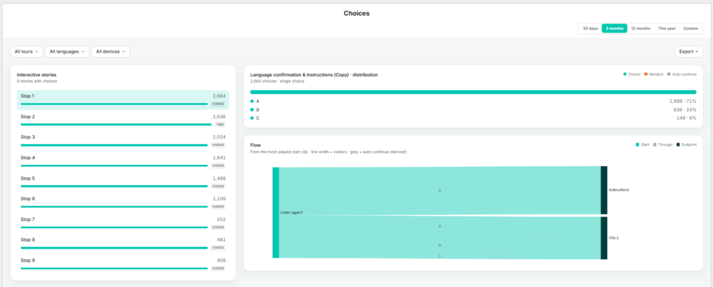
The Choices page shows how visitors navigate interactive, branching stories — those where a listener selects a direction or option rather than the tour continuing automatically to the next stop.
Interactive Stories
A list of every story in your account that includes at least one choice point, ranked by number of choices made and tagged CHOICE. Select a story from this list to view its distribution and flow below.
Distribution
For the selected interactive story, this shows a breakdown of every option chosen and how often — for example, Left, Up, Right, Down — each with a count and share. The legend distinguishes three types of navigation:
Choice — the visitor actively selected this option.
Random — the system selected on the visitor’s behalf, for example when no input was given.
Auto-continue — the tour advanced automatically because there was no choice to make. This is a derived path rather than a genuine branch.
Flow
A flow diagram tracing visitors from the most-played starting clip through to their eventual destination. Line width represents the number of visitors; grey lines represent auto-continue paths. This view is the most effective way to identify whether one branch is significantly more popular than others, or whether a branch is being bypassed via auto-continue rather than genuinely avoided.
Before drawing conclusions from the Distribution chart, check the legend to confirm how much of the total was Choice versus Random or Auto-continue — a branch can look popular simply because it’s the system default.
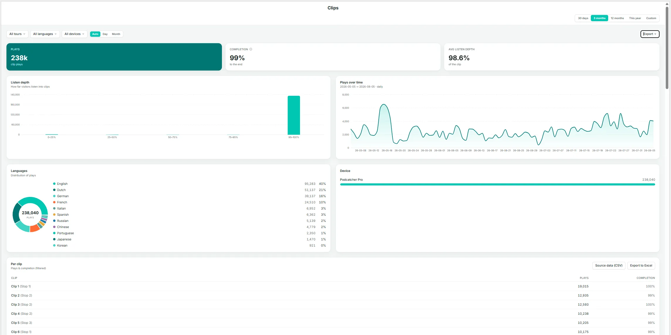
The Clips page is the most granular level of detail within Insights. A story can consist of several clips — for example, an introduction, a choice point, and a follow-up — and this page shows how much of each individual clip is actually heard.
Key Metrics
Plays — total clip plays in the current selection.
Completion — the percentage of plays that reached the end of the clip.
Avg listen depth — the average distance listeners get into a clip, expressed as a percentage across all plays — a more granular companion to Completion.
Listen Depth
A histogram grouping plays by how far they progressed (0–25%, 25–50%, 50–75%, 75–95%, 95–100%). A well-performing clip should show most plays in the 95–100% band; a large share of early drop-off in another band indicates a clip worth reviewing for length, pacing, or content.
Plays Over Time
Daily play volume for clips in the current selection.
Languages
A donut chart and list of play share by language.
Apparaat
A breakdown by device type.
Per Clip Table
Clip name (shown with its parent story in parentheses), plays, and completion rate, with Source data (CSV) en Export to Excel options.
Listen Depth Per Clip
A stacked bar per clip, ordered by volume, showing the share of plays in each depth band (darker shading indicates a more complete listen). Select Show all clips to view beyond the default set.
Other devices (App, Mobile Website) log a finished yes/no, which is counted into the 95–100% band (yes) or the 50–75% band (no) on this chart — keep this in mind if your audience skews toward non-Podcatcher devices.
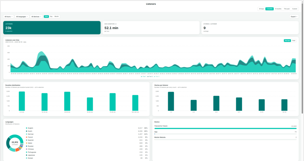
The Tours page shows listener behavior on a per-tour basis — who is listening, for how long, and when. The page itself is titled Listeners, since every chart is built from listener sessions grouped by tour.
Key Metrics
Listeners — total listeners in the current selection (with any tour, language, or device filters applied).
Avg duration — average time spent per tour, within the current selection.
Stories / listener — average number of stories played per listener.
Listeners Over Time
Listener volume stacked by tour, showing each tour’s contribution to the total by day. Toggle between Per tour (stacked view) and Total (combined line).
Duration Distribution
A bar chart grouping listeners by how long they spent (for example, 0–5 min, 10–30 min, 35–45 min, up to 100+ min). Useful for identifying whether most visitors complete the full tour or leave early.
Stories Per Listener
A bar chart grouping listeners by how many stories they played (1–2, 3–5, 6–7, and so on). This complements the duration chart: a listener spending a long time but playing few stories may be lingering rather than progressing through the tour.
Languages
A donut chart and list, matching the format on the Languages page but scoped to the current tour and date filters.
Apparaat
A breakdown by Podcatcher classis, App, and Mobile Website.
Listeners by Weekday × Hour
A heatmap showing when listening activity occurs, with darker cells indicating busier periods. Useful for planning staffing, hardware allocation, or maintenance windows during quieter times.
Avg Tour Duration Per Weekday
A bar chart comparing average duration by day of the week — for example, to check whether weekend visitors spend more time than weekday visitors.
Per Tour Table
Listeners, average duration, and stories per listener broken out by individual tour, with Source data (CSV) en Export to Excel options.
Use the All tours, All languages, and All devices filters at the top of the page to isolate a single tour before reading the charts — every chart and table on the page reflects these filters.
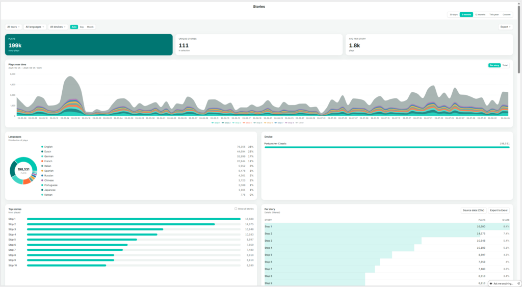
The Stops page shows which individual stories (stops) are played, how often, and when. The sidebar labels this page Stops; the page itself is titled Stories — a stop on a tour is the point at which a story plays, so the two terms describe the same thing from different angles: the physical location versus the audio content delivered there.
Key Metrics
Plays — total story-plays in the current selection (one listener playing one story once counts as one play).
Unique stories — the number of distinct stories played at least once in the selection.
Avg per story — average plays per story (total plays divided by unique stories).
Plays Over Time
Play volume stacked by story, toggling between Per story en Total. With a large number of stories, the chart displays the top contributors alongside an “Other” category.
Languages
A donut chart and list showing play share by language.
Apparaat
A breakdown by Podcatcher Pro, App, and Mobile Website.
Top Stories
A ranked list of the most-played stories. Select Show all stories to expand beyond the default view.
Per Story Table
Story name, plays, and share, sortable and exportable via Source data (CSV) en Export to Excel.
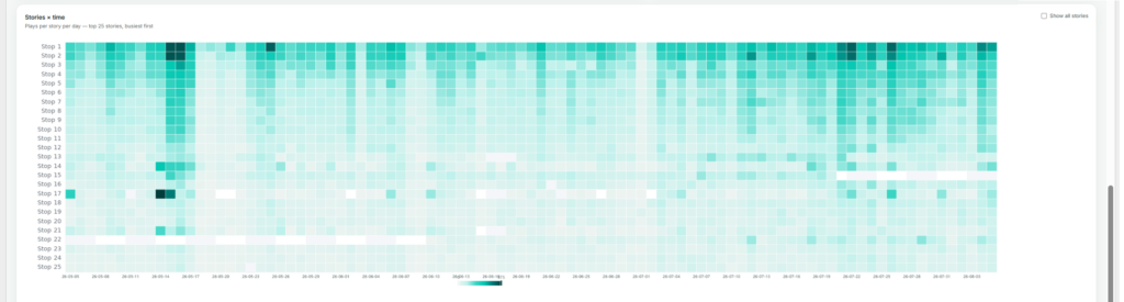
Stories × Time
A heatmap of plays per story per day, showing the busiest stories by default (also expandable with Show all stories). This view is useful for spotting a story that suddenly spikes or goes quiet, which more often points to a technical issue — such as a broken trigger point — than a genuine change in visitor interest.
If a story’s plays drop suddenly, check the Stories × time heatmap first to pinpoint exactly when it happened — it usually narrows the cause down to a specific day rather than a gradual decline.
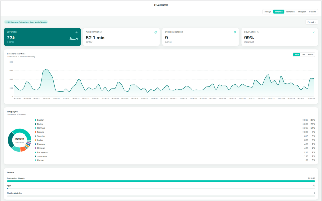
When you and your visitors use the tours you have created on the platform, the system automatically collects performance data. The Overview page brings the most important of these metrics together in one place, so you can judge overall performance before deciding whether any other Insights page is worth exploring in more detail.
Finding the Overview page
After logging in to the platform, you are taken directly to the Insights → Overview page. If you navigate elsewhere, you can return by selecting Insights in the sidebar, then Overzicht.
What This Page Shows
The Overview page brings together a set of graphs and figures that summarize how your tours are performing as a whole:
Key metrics — listeners, average duration, stories per listener, and completion
Listeners over time
Language distribution
Device breakdown
Key Metrics
Listeners — the total number of people who used a tour during the selected period.
Avg duration — the average time spent per tour.
Stories / listener — the average number of stories (stops) a listener plays per visit. A useful indicator of engagement depth.
Completion — the percentage of clips played through to the end. A high completion rate generally indicates that content length and pacing are working well.
Listeners Over Time
A daily or monthly chart of listener volume across the selected date range. Use the Auto / Day / Month toggle to adjust the granularity.
Languages
A donut chart and ranked list showing listener share by language. This is a condensed view of the full Languages pagina.
Apparaat
A breakdown of the devices visitors used: Podcatcher Pro (dedicated hardware), de Appof Mobiele Website. For most venues, Podcatcher Pro accounts for the large majority of usage.
By checking the Overview page regularly, you can catch emerging trends early and decide with confidence where in Insights to focus your attention next.
The summary line above the metrics (for example, “22,776 listeners · Podcatcher + App + Mobile Website”) shows which channels are included in the figures below — useful context before comparing periods.
Actionable Insights zet uw Podcatcher Pro-systeemgegevens om in tijdige aanbevelingen waarmee u verstoringen kunt voorkomen en de bezoekerservaring kunt optimaliseren. Dit intelligente meldingssysteem houdt u op de hoogte van de hardwarestatus en tourprestaties, zodat u mogelijke problemen kunt aanpakken voordat uw gasten er last van hebben.
Snelle referentie
Toegang tot berichtencentrum: Dashboard → Pictogram Berichtencentrum
E-mailconfiguratie: Profiel → E-mailvoorkeuren
Meldingsniveaus: Licht, matig, ernstig (geprioriteerd op urgentie)
Primaire kenmerken: Hardwarebewaking, inzicht in tourprestaties, waarschuwingen per e-mail
Hoe Actionable Insights werkt
Het Actionable Insights-systeem bewaakt uw Podcatcher Pro-omgeving continu en analyseert zowel de hardwarestatus als de interacties met bezoekers om verbetermogelijkheden te identificeren. Wanneer het systeem een probleem of optimalisatiemogelijkheid ontdekt, genereert het een melding met een duidelijke aanbeveling voor actie.
Meldingssysteem
Actionable Insights categoriseert meldingen op prioriteit zodat u zich kunt concentreren op wat het belangrijkst is:
Kleine mededelingen (Informatief)
Informatieve updates die geen onmiddellijke actie vereisen
Kritieke kwesties die onmiddellijke aandacht vereisen
Voorbeelden: offline basecamps, Podcatchers in foutstatus
Essentieel voor het voorkomen van verstoring van bezoekerservaringen
Het berichtencentrum gebruiken
Het Berichtencentrum dient als centraal punt voor alle meldingen en biedt duidelijke informatie over elk probleem en aanbevolen oplossingen.
Toegang tot het berichtencentrum
Log in op het Guide-ID platform
Zoek naar de kop Berichtcentrum in de linkerbovenbalk
Klik om het dashboard met meldingen te openen
Berichtencentrum-waarschuwingen begrijpen
Elke melding in het Berichtencentrum bevat:
Waarschuwingspictogram die het prioriteitsniveau aangeeft
Duidelijke beschrijving van het gedetecteerde probleem
Actieaanbeveling om het probleem op te lossen
Tijdstempel die aangeeft wanneer het probleem is gedetecteerd
For example, a typical notification might alert you that “IDentifier with serial number BP.000.433 is low on battery” and recommend that you “Please replace or recharge the battery to keep using this IDentifier.”
Let op: Voor een volledige referentie van alle mogelijke meldingen en aanbevolen acties, zie [Typen meldingen en aanbevelingen].
Uw meldingen beheren
Met het Berichtencentrum kunt u:
Alle actieve meldingen bekijken op één handige locatie
Meldingen afwijzen zodra je ze hebt aangepakt
Resolutiestatus bijhouden omdat het systeem vaste problemen automatisch verwijdert
Toegankelijkheid Het Message Center is ontworpen om kritieke informatie in één oogopslag te presenteren, waardoor het waardevol is voor drukke museumomgevingen waar het personeel soms maar even de tijd heeft om de systeemstatus te controleren.
Systeem voor e-mailmeldingen
Om ervoor te zorgen dat u nooit belangrijke waarschuwingen mist, gaat Actionable Insights verder dan het platform met strategische e-mailmeldingen.
Typen e-mailwaarschuwingen
Wekelijkse overzicht e-mails
Uitgebreid overzicht van alle lopende meldingen
Geprioriteerd op urgentieniveau
Biedt een handige manier om op de hoogte te blijven, zelfs als je niet bent ingelogd op het platform
Je kunt je meldingservaring aanpassen aan de behoeften van je museum:
Navigeer naar Profiel -> E-mail voorkeuren in het Guide-ID platform
Selecteer Voorkeuren voor meldingen
Kies welke e-mailtypes je wilt verzenden.
Uw instellingen opslaan
Belangrijkste bewakingsmogelijkheden
Actionable Insights controleert twee primaire aspecten van je museumbeleving:
1. Hardware gezondheidsmonitoring
Het systeem volgt proactief de status van je Guide-ID hardware, inclusief:
IDentifier Batterijniveaus
Waarschuwingen wanneer batterijen een lage drempel bereiken
Helpt onderbrekingen van audiotours in specifieke tentoonstellingsruimten te voorkomen
Maakt gepland onderhoud mogelijk in plaats van noodreacties
Podcatcher-apparaatstatus
Identificeert ontbrekende apparaten om de inventaris bij te houden
Detecteert Podcatchers in foutstatussen
Controleert de connectiviteit van synchronisatieapparaten
2. Tour Prestatie Analyse
Naast hardware helpt Actionable Insights bij het optimaliseren van de contentervaring met:
Analyse van gebruikspatronen
Identificeert onderbenutte of zeer populaire tourhaltes
Helpt u inzicht te krijgen in de betrokkenheidspatronen van bezoekers
Biedt inzichten voor contentverbeteringen
Problemen oplossen Bruikbare inzichten
Als u problemen ondervindt met het Actionable Insights-systeem, probeer dan deze eenvoudige oplossingen:
Uitgave
Oplossing
Geen e-mailmeldingen ontvangen
Controleer uw spam-map en controleer of uw e-mailadres correct is in Gebruikersinstellingen
Verwachte meldingen missen
Controleer of uw meldingsvoorkeuren correct zijn geconfigureerd en of u het bericht niet hebt verworpen.
Melding voor ontslag verschijnt opnieuw
Het onderliggende probleem is mogelijk niet volledig opgelost
Waarschuwing If you dismiss multiple IDentifier battery warnings without replacing batteries, you risk unexpected audio tour disruptions for your visitors. Always follow recommended actions when possible.
Succesindicatoren
U weet dat u Actionable Insights effectief gebruikt wanneer:
Vermijdbare hardwareproblemen in uw museum nemen af
Personeel kan potentiële problemen aanpakken voordat ze gevolgen hebben voor bezoekers
Uw batterijvervangingsproces wordt proactief in plaats van reactief
Vermiste Podcatcher-incidenten dalen
Voor aanvullende hulp met Actionable Insights, contact op met Guide-ID ondersteuning via het Helpcentrum van het platform of e-mail Helpdesk@guide-id.com.
Download je tourgegevens als CSV-bestanden voor externe verwerking en diepere inzichten
Met de exportfunctie kunt u uitgebreide touranalysegegevens downloaden voor aangepaste analyse in de tools van uw voorkeur. Volg deze eenvoudige stappen om toegang te krijgen tot je waardevolle statistieken over bezoekersbetrokkenheid.
Snelle referentie
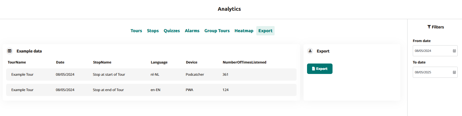
Navigeer naar Analytics → Exporteer in het hoofdmenu
Stel het gewenste datumbereik in met de datumselectoren Van/Tot
Klik op de knop "Exporteren" om uw gegevensbestand te genereren
Download het CSV-bestand wanneer de verwerking is voltooid
Bestanden krijgen automatisch een naam met je sitenaam en datumbereik
Gebruik het in uw dataplatform
De exportfunctie openen
Log in op het Guide-ID platform
Selecteer "Analytics" in het linker navigatiemenu
Klik op het tabblad "Exporteren" in de bovenste menubalk
Exportparameters instellen
Gebruik de datumfilters in de rechterzijbalk:
Klik op "Vanaf datum" om uw begindatum te selecteren
Klik op "Tot datum" om uw einddatum te selecteren
Uw export genereren
Klik op de blauwe knop "Exporteren
Wacht even terwijl de verwerkingsindicator aangeeft dat uw bestand wordt voorbereid
Na voltooiing wordt het bestand automatisch gedownload naar je apparaat
De bestanden hebben de naam "SiteName-Analytics-YYYYMMDD-YYYMMDD.csv".
Uw gegevens begrijpen
Het geëxporteerde CSV-bestand bevat de volgende gegevenskolommen:
TourNaam: De naam van de tour zoals geconfigureerd in het platform
Datum: De datum waarop de interactie met de bezoeker plaatsvond (indeling JJJJ-MM-DD)
StopNaam: De specifieke audiostop of het ID-identificatiepunt
Taal: De door de bezoeker geselecteerde taalcode (bijv. en-EN, nl-NL)
Apparaat: Het type afspeelapparaat (Podcatcher of PWA voor webapp)
NumberOfTimesListened: Totaal aantal afspeelbeurten voor elke stop
Problemen met exporteren oplossen
Uitgave
Oplossing
CSV-bestand heeft onjuiste opmaak
Open in een speciaal spreadsheetprogramma in plaats van een tekstverwerker
Ontbrekende gegevens voor specifieke tours
Controleer of de tours actief waren tijdens je geselecteerde datumbereik
Door het exporteren van uw Guide-ID analytics data, krijg je de flexibiliteit om diepere analyses uit te voeren dan het platform ingebouwde visualisaties. Deze directe toegang tot uw bezoeker engagement statistieken macht machtigt data-gestuurde beslissingen over content ontwikkeling, tour optimalisatie, en de toewijzing van middelen.
Wanneer jij en je bezoekers gebruik maken van de tours die je hebt gemaakt op het Guide-ID Platform, verzamelt het systeem automatisch analytische gegevens.
Deze statistieken zijn van onschatbare waarde voor het evalueren van de prestaties van je tours, stops en clips, maar ook voor het analyseren van de betrokkenheid van gebruikers met quizzen en enquêtes.
De analysepagina vinden
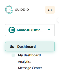
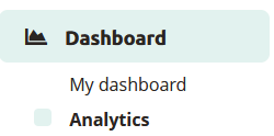
Na het inloggen op het Guide-ID Platform, kom je terecht op het Dashboard. Om naar de Analytics-pagina te gaan, kun je deze vinden in de zijbalk onder het Dashboard.
Tours
Op het tabblad tours vind je een verzameling informatieve grafieken met belangrijke gegevens over je tours. Deze omvatten het aantal gespeelde tours, het totale aantal gedeelde verhalen, de duur van elke tour en het gemiddelde aantal bezochte stops per tour.
Stops
Het tabblad Stops biedt waardevolle inzichten in de meest en minst gespeelde stops en de triggers die tot het afspelen hebben geleid. Populaire stops geven meestal de voorkeur van bezoekers aan, terwijl minder vaak bezochte stops zich in minder toegankelijke gebieden kunnen bevinden of worden aangetroffen wanneer bezoekers moe zijn van de rondleiding door het museum.
Clips
Dit gedeelte geeft informatie over de gekozen opties en hoe ze zich verhouden tot alternatieve keuzes, en biedt waardevolle inzichten in de voorkeuren van bezoekers.
Alarmen
Op het tabblad Alarmen kun je de frequentie controleren waarmee alarmen werden geactiveerd en het meest geactiveerde alarm identificeren (als er meerdere alarmen zijn ingesteld).
Rondleidingen voor groepen
Dit is op abonnementsbasis voor Podcatcher Pro-klanten. Neem voor vragen contact op met onze Helpdesk of een van onze Business Managers
Heatmap
Dit gedeelte geeft informatie over bezoekersaantallen en -percentages voor de geselecteerde tourhaltes. Je kunt een maand en jaar selecteren en dan een specifieke tour kiezen.
De stops voor de geselecteerde tour worden weergegeven in een tabel, gerangschikt per dag.
De tabel toont luisterpercentages als percentages. Om te schakelen tussen percentages en bezoekersaantallen, klikt u op de knop Omschakelen bezoekersaantal/percentage.
De kleur van de tabelcellen varieert op basis van de luisterpercentages
Exporteer
Via het tabblad Exporteren kun je zelf analytics-gegevens over stops downloaden, om te gebruiken voor je eigen displays of om te combineren met gegevens van andere analytics-platforms die je voor je museum gebruikt. Bekijk onze Analytics-gegevens exporteren voor meer informatie.



 Tours
Tours


 Nederlands
  English
  Français