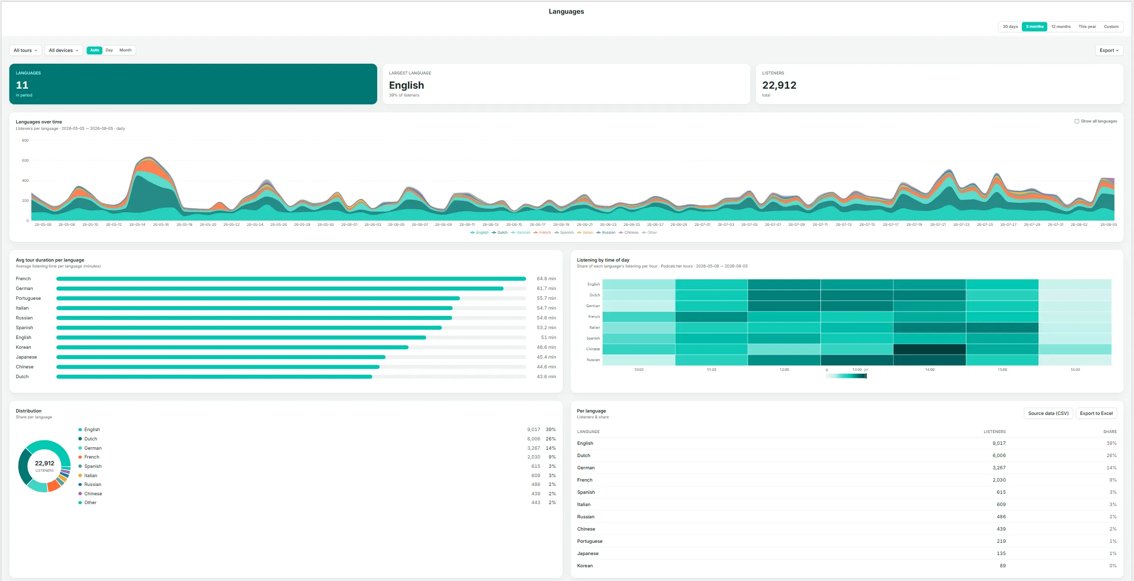
The Languages page gives you a focused view of which languages your visitors listen in, and how that mix is trending over time — the detail behind findings such as a language growing in share, as surfaced on the Overview page.
Key Metrics
Languages — the number of distinct languages used during the period.
Largest language — the single largest language by listener share, with its percentage.
Listeners — total listeners in the current selection.
Languages Over Time
A stacked area chart of listeners by language across the date range. By default, smaller languages are grouped together; select Show all languages to display every language individually.
Avg Tour Duration Per Language
A bar chart ranking languages by average time spent. Notable differences here can indicate translation or narration-pacing issues — for example, if one language runs noticeably longer or shorter than the rest, it may be worth reviewing that recording.
Listening by Time of Day
A heatmap showing each language’s share of listening by hour, useful for identifying whether evening visitors, for instance, skew toward a different language mix than daytime visitors.
Distribution
A donut chart breakdown of listener share by language.
Per Language Table
Listeners and share for every language, with Source data (CSV) and Export to Excel options.
If a language’s share is growing, use the Tours page to check whether that growth is concentrated in one tour or spread across your whole catalog before deciding where to expand coverage.
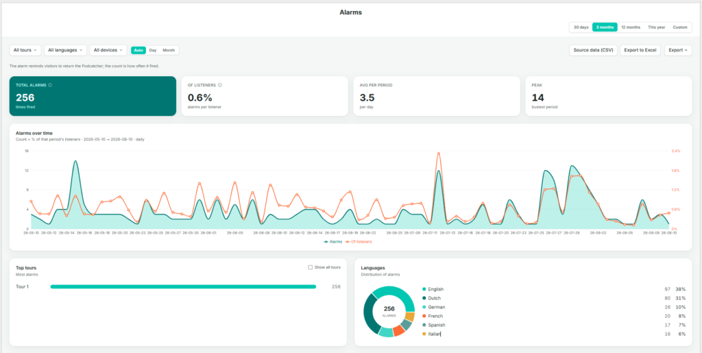
The Alarms page tracks the “return the Podcatcher” reminder alarm — how often it fires, and for what share of listeners. This is primarily an operations and hardware-recovery metric rather than a content metric.
As the page itself notes: the alarm reminds visitors to return the Podcatcher; the count is how often it fired.
Key Metrics
Total alarms — the number of times the alarm fired during the selection.
Of listeners — alarms as a percentage of total listeners, indicating how often a session ends in a reminder alarm rather than a standard return.
Avg per period — the average number of alarms per day, or per the selected granularity.
Peak — the busiest single period for alarms within the selection.
Alarms Over Time
A dual-axis daily chart showing alarm count (area) alongside the percentage of that period’s listeners (line), making it possible to see whether alarm counts are rising because of higher visitor numbers or because a larger share of visitors are forgetting to return devices.
Top Tours
The tours generating the most alarms, ranked, with Show all tours to expand the list.
Languages
A donut chart and list of alarm share by language, useful for identifying whether one language group tends to forget devices more often, which may point to unclear instructions or a translation gap rather than a behavioral difference.
Use Source data (CSV) or Export to Excel on this page to share alarm trends with your hardware or operations team, particularly ahead of busy periods where late returns can cause delays at handback.
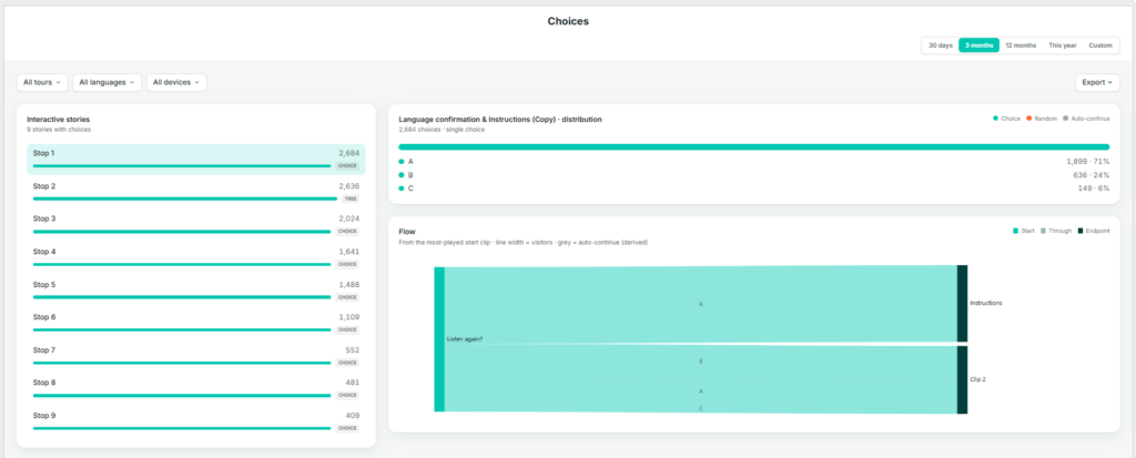
The Choices page shows how visitors navigate interactive, branching stories — those where a listener selects a direction or option rather than the tour continuing automatically to the next stop.
Interactive Stories
A list of every story in your account that includes at least one choice point, ranked by number of choices made and tagged CHOICE. Select a story from this list to view its distribution and flow below.
Distribution
For the selected interactive story, this shows a breakdown of every option chosen and how often — for example, Left, Up, Right, Down — each with a count and share. The legend distinguishes three types of navigation:
Choice — the visitor actively selected this option.
Random — the system selected on the visitor’s behalf, for example when no input was given.
Auto-continue — the tour advanced automatically because there was no choice to make. This is a derived path rather than a genuine branch.
Flow
A flow diagram tracing visitors from the most-played starting clip through to their eventual destination. Line width represents the number of visitors; grey lines represent auto-continue paths. This view is the most effective way to identify whether one branch is significantly more popular than others, or whether a branch is being bypassed via auto-continue rather than genuinely avoided.
Before drawing conclusions from the Distribution chart, check the legend to confirm how much of the total was Choice versus Random or Auto-continue — a branch can look popular simply because it’s the system default.
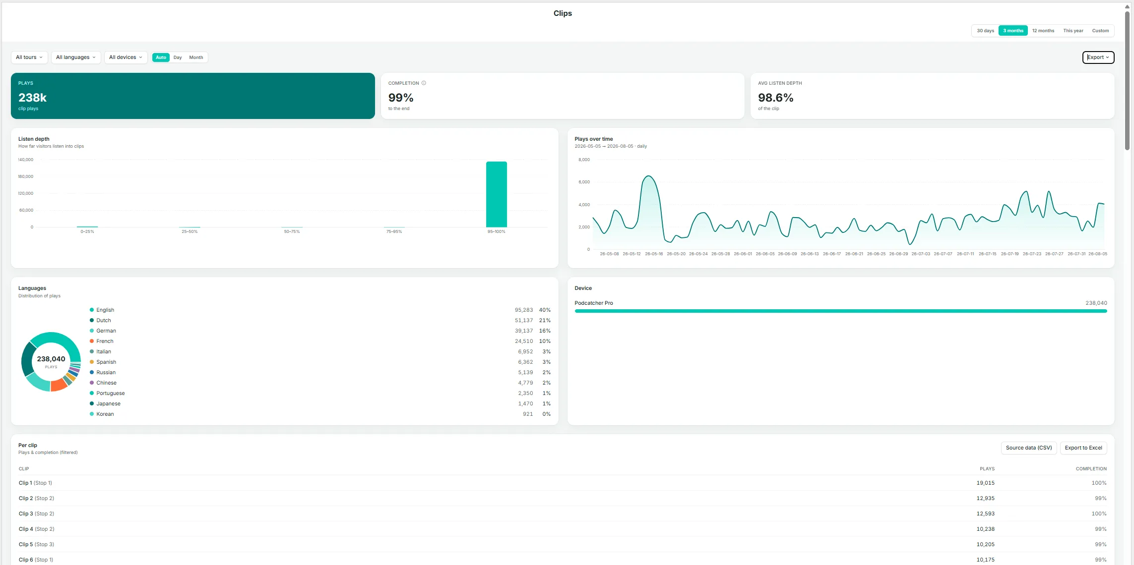
The Clips page is the most granular level of detail within Insights. A story can consist of several clips — for example, an introduction, a choice point, and a follow-up — and this page shows how much of each individual clip is actually heard.
Key Metrics
Plays — total clip plays in the current selection.
Completion — the percentage of plays that reached the end of the clip.
Avg listen depth — the average distance listeners get into a clip, expressed as a percentage across all plays — a more granular companion to Completion.
Listen Depth
A histogram grouping plays by how far they progressed (0–25%, 25–50%, 50–75%, 75–95%, 95–100%). A well-performing clip should show most plays in the 95–100% band; a large share of early drop-off in another band indicates a clip worth reviewing for length, pacing, or content.
Plays Over Time
Daily play volume for clips in the current selection.
Languages
A donut chart and list of play share by language.
Device
A breakdown by device type.
Per Clip Table
Clip name (shown with its parent story in parentheses), plays, and completion rate, with Source data (CSV) and Export to Excel options.
Listen Depth Per Clip
A stacked bar per clip, ordered by volume, showing the share of plays in each depth band (darker shading indicates a more complete listen). Select Show all clips to view beyond the default set.
Other devices (App, Mobile Website) log a finished yes/no, which is counted into the 95–100% band (yes) or the 50–75% band (no) on this chart — keep this in mind if your audience skews toward non-Podcatcher devices.
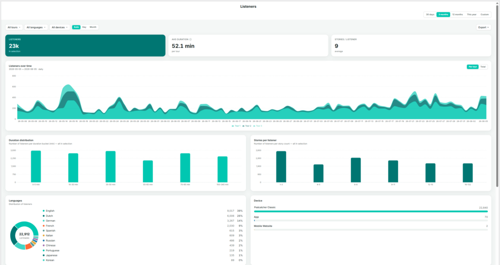
The Tours page shows listener behavior on a per-tour basis — who is listening, for how long, and when. The page itself is titled Listeners, since every chart is built from listener sessions grouped by tour.
Key Metrics
Listeners — total listeners in the current selection (with any tour, language, or device filters applied).
Avg duration — average time spent per tour, within the current selection.
Stories / listener — average number of stories played per listener.
Listeners Over Time
Listener volume stacked by tour, showing each tour’s contribution to the total by day. Toggle between Per tour (stacked view) and Total (combined line).
Duration Distribution
A bar chart grouping listeners by how long they spent (for example, 0–5 min, 10–30 min, 35–45 min, up to 100+ min). Useful for identifying whether most visitors complete the full tour or leave early.
Stories Per Listener
A bar chart grouping listeners by how many stories they played (1–2, 3–5, 6–7, and so on). This complements the duration chart: a listener spending a long time but playing few stories may be lingering rather than progressing through the tour.
Languages
A donut chart and list, matching the format on the Languages page but scoped to the current tour and date filters.
Device
A breakdown by Podcatcher classis, App, and Mobile Website.
Listeners by Weekday × Hour
A heatmap showing when listening activity occurs, with darker cells indicating busier periods. Useful for planning staffing, hardware allocation, or maintenance windows during quieter times.
Avg Tour Duration Per Weekday
A bar chart comparing average duration by day of the week — for example, to check whether weekend visitors spend more time than weekday visitors.
Per Tour Table
Listeners, average duration, and stories per listener broken out by individual tour, with Source data (CSV) and Export to Excel options.
Use the All tours, All languages, and All devices filters at the top of the page to isolate a single tour before reading the charts — every chart and table on the page reflects these filters.
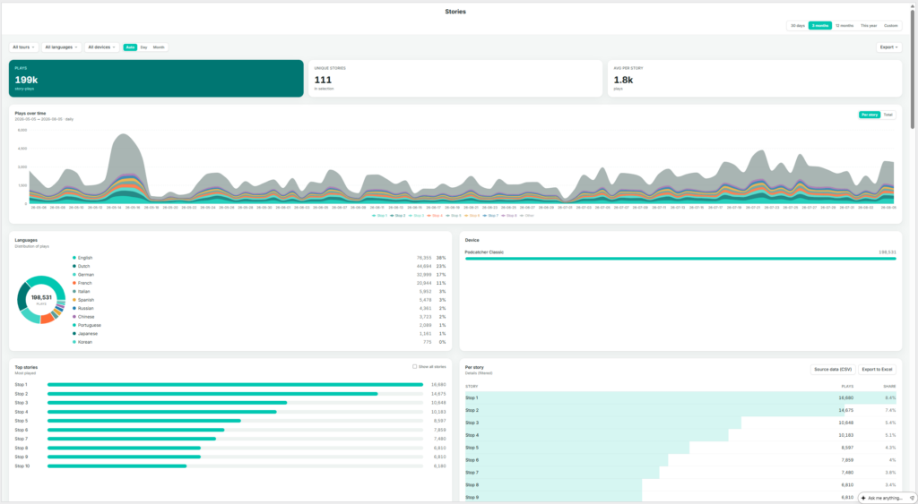
The Stops page shows which individual stories (stops) are played, how often, and when. The sidebar labels this page Stops; the page itself is titled Stories — a stop on a tour is the point at which a story plays, so the two terms describe the same thing from different angles: the physical location versus the audio content delivered there.
Key Metrics
Plays — total story-plays in the current selection (one listener playing one story once counts as one play).
Unique stories — the number of distinct stories played at least once in the selection.
Avg per story — average plays per story (total plays divided by unique stories).
Plays Over Time
Play volume stacked by story, toggling between Per story and Total. With a large number of stories, the chart displays the top contributors alongside an “Other” category.
Languages
A donut chart and list showing play share by language.
Device
A breakdown by Podcatcher Pro, App, and Mobile Website.
Top Stories
A ranked list of the most-played stories. Select Show all stories to expand beyond the default view.
Per Story Table
Story name, plays, and share, sortable and exportable via Source data (CSV) and Export to Excel.
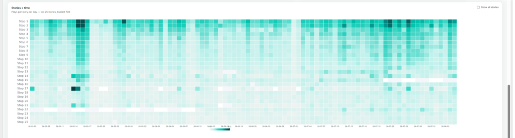
Stories × Time
A heatmap of plays per story per day, showing the busiest stories by default (also expandable with Show all stories). This view is useful for spotting a story that suddenly spikes or goes quiet, which more often points to a technical issue — such as a broken trigger point — than a genuine change in visitor interest.
If a story’s plays drop suddenly, check the Stories × time heatmap first to pinpoint exactly when it happened — it usually narrows the cause down to a specific day rather than a gradual decline.
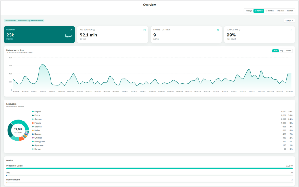
When you and your visitors use the tours you have created on the platform, the system automatically collects performance data. The Overview page brings the most important of these metrics together in one place, so you can judge overall performance before deciding whether any other Insights page is worth exploring in more detail.
Finding the Overview page
After logging in to the platform, you are taken directly to the Insights → Overview page. If you navigate elsewhere, you can return by selecting Insights in the sidebar, then Overview.
What This Page Shows
The Overview page brings together a set of graphs and figures that summarize how your tours are performing as a whole:
Key metrics — listeners, average duration, stories per listener, and completion
Listeners over time
Language distribution
Device breakdown
Key Metrics
Listeners — the total number of people who used a tour during the selected period.
Avg duration — the average time spent per tour.
Stories / listener — the average number of stories (stops) a listener plays per visit. A useful indicator of engagement depth.
Completion — the percentage of clips played through to the end. A high completion rate generally indicates that content length and pacing are working well.
Listeners Over Time
A daily or monthly chart of listener volume across the selected date range. Use the Auto / Day / Month toggle to adjust the granularity.
Languages
A donut chart and ranked list showing listener share by language. This is a condensed view of the full Languages page.
Device
A breakdown of the devices visitors used: Podcatcher Pro (dedicated hardware), App, or Mobile Website. For most venues, Podcatcher Pro accounts for the large majority of usage.
By checking the Overview page regularly, you can catch emerging trends early and decide with confidence where in Insights to focus your attention next.
The summary line above the metrics (for example, “22,776 listeners · Podcatcher + App + Mobile Website”) shows which channels are included in the figures below — useful context before comparing periods.
Actionable Insights transforms your Podcatcher Pro system data into timely recommendations that help you prevent disruptions and optimize visitor experiences. This intelligent notification system keeps you informed about hardware status and tour performance, allowing you to address potential issues before they affect your guests.
Quick Reference
Access Message Center: Dashboard → Message Center icon
Email configuration: Profile → Email Preferences
Notification Levels: Minor, Moderate, Severe (prioritized by urgency)
Primary Features: Hardware monitoring, tour performance insights, email alerts
How Actionable Insights Works
The Actionable Insights system continuously monitors your Podcatcher Pro environment, analyzing both hardware status and visitor interactions to identify opportunities for improvement. When the system detects an issue or optimization opportunity, it generates a notification with a clear recommendation for action.
Notification System
Actionable Insights categorizes notifications by priority to help you focus on what matters most:
Minor Notifications (Informative)
Informational updates that don’t require immediate action
Examples: system updates available, infrequently used tour stops
Useful for long-term planning and optimization
Moderate Notifications (Requires Attention)
Issues that should be addressed to maintain optimal performance
Examples: offline basecamps, Podcatchers in error state
Essential for preventing disruption to visitor experiences
Using the Message Center
The Message Center serves as your central hub for all notifications, providing clear information about each issue and recommended solutions.
Accessing the Message Center
Log in to the Guide-ID platform
Look for the Message Center header in the top left bar
Click to open your notification dashboard
Understanding Message Center Alerts
Each notification in the Message Center includes:
Alert icon indicating the priority level
Clear description of the detected issue
Actionable recommendation to resolve the problem
Timestamp showing when the issue was detected
For example, a typical notification might alert you that “IDentifier with serial number BP.000.433 is low on battery” and recommend that you “Please replace or recharge the battery to keep using this IDentifier.”
Note: For a complete reference of all possible notifications and recommended actions, see [Notification Types and Recommendations].
Managing Your Notifications
The Message Center allows you to:
Review all active notifications in one convenient location
Dismiss notifications once you’ve addressed them
Track resolution status as the system automatically removes fixed issues
Accessibility Consideration The Message Center is designed to present critical information at a glance, making it valuable for busy museum environments, where staff may only have moments between visitor interactions to check system status.
Email Notification System
To ensure you never miss important alerts, Actionable Insights extends beyond the platform with strategic email notifications.
Email Alert Types
Weekly Summary Emails
Comprehensive overview of all pending notifications
Prioritized by urgency level
Provides a convenient way to stay informed even when not logged into the platform
Urgent Alert Emails
Sent when critical issues require immediate attention
Focus specifically on severe notifications
Customizing Email Preferences
You can tailor your notification experience to match your museum’s needs:
Navigate to Profile -> Email preferences in the Guide-ID platform
Select Notification Preferences
Choose which E-mail types you’d like to be sent.
Save your settings
Key Monitoring Capabilities
Actionable Insights monitors two primary aspects of your museum experience:
1. Hardware Health Monitoring
The system proactively tracks the status of your Guide-ID hardware, including:
IDentifier Battery Levels
Alerts when batteries reach low thresholds
Helps prevent audio tour disruptions in specific exhibit areas
Enables planned maintenance rather than emergency responses
Podcatcher Device Status
Identifies missing devices to maintain inventory
Detects Podcatchers in error states
Monitors Sync Device connectivity
2. Tour Performance Analysis
Beyond hardware, Actionable Insights helps optimize the content experience with:
Usage Pattern Analysis
Identifies underutilized or highly popular tour stops
Helps you understand visitor engagement patterns
Provides insights for content improvements
Troubleshooting Actionable Insights
If you encounter issues with the Actionable Insights system, try these simple solutions:
Issue
Solution
Not receiving email notifications
Check your spam folder and verify your email address is correct in User Settings
Missing expected notifications
Confirm your notification preferences are properly configured, and that you have not dismissed the message
Dismissed notification reappears
The underlying issue may not be fully resolved
Warning If you dismiss multiple IDentifier battery warnings without replacing batteries, you risk unexpected audio tour disruptions for your visitors. Always follow recommended actions when possible.
Success Indicators
You’ll know you’re effectively using Actionable Insights when:
Preventable hardware issues decrease across your museum
Staff can address potential problems before they impact visitors
Your battery replacement process becomes proactive rather than reactive
Missing Podcatcher incidents decline
For additional assistance with Actionable Insights, contact Guide-ID support through the platform’s Help Center or email Helpdesk@guide-id.com.
Download your tour metrics as CSV files for external processing and deeper insights
The Export feature lets you download comprehensive tour analytics data for custom analysis in your preferred tools. Follow these simple steps to access your valuable visitor engagement metrics.
Quick Reference
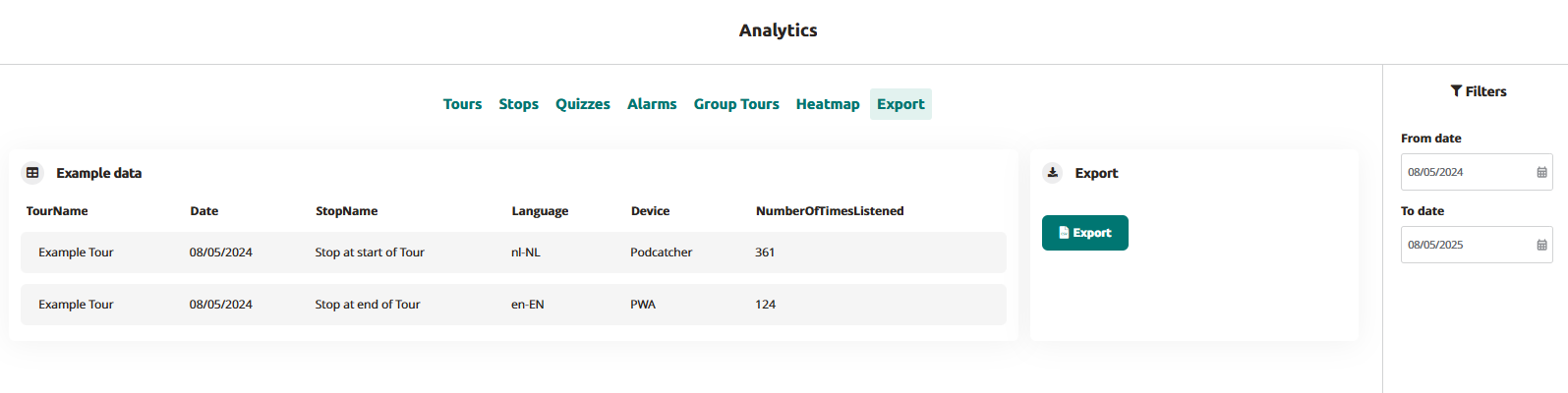
Navigate to Analytics → Export in the main menu
Set your desired date range using the From/To date selectors
Click the “Export” button to generate your data file
Download the CSV file when processing is complete
Files are named automatically with your site name and date range
Use it in your data platform
Accessing the Export Function
Log in to the Guide-ID platform
Select “Analytics” from the left navigation menu
Click the “Export” tab in the top menu bar
Setting Export Parameters
Use the date filters in the right sidebar:
Click “From date” to select your starting date
Click “To date” to select your ending date
Generating Your Export
Click the blue “Export” button
Wait briefly while the processing indicator shows your file is being prepared
When complete, the file will automatically download to your device
Files are named “SiteName-Analytics-YYYYMMDD-YYYYMMDD.csv”
Understanding Your Data
Your exported CSV file will contain the following data columns:
TourName: The name of the tour as configured in the platform
Date: The date when the visitor interaction occurred (YYYY-MM-DD format)
StopName: The specific audio stop or IDentifier point
Language: The language code selected by the visitor (e.g., en-EN, nl-NL)
Device: The playback device type (Podcatcher or PWA for web app)
NumberOfTimesListened: Total play count for each stop
Troubleshooting Export Issues
Issue
Solution
CSV file shows incorrect formatting
Open in a dedicated spreadsheet program rather than a text editor
Missing data for specific tours
Check that the tours were active during your selected date range
By exporting your Guide-ID analytics data, you gain the flexibility to perform deeper analysis beyond the platform’s built-in visualizations. This direct access to your visitor engagement metrics empowers data-driven decisions about content development, tour optimization, and resource allocation.
When you and your visitors use the tours you have created on the Guide-ID Platform, the system automatically collects analytics data.
These metrics are invaluable for evaluating the performance of your tours, stops, and clips, as well as analyzing user engagement with quizzes and surveys.
Finding the analytics page
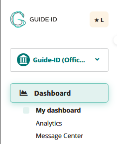
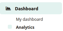
Upon logging in to the Guide-ID Platform, you will land on the Dashboard. To navigate to the Analytics page, simply locate it in the sidebar below the Dashboard section.
Tours
Within the tours tab, you will find a collection of informative graphs that provide key details about your tours. These include the number of tours played, the total number of stories shared, the duration of each tour, and the average number of stops visited per tour.
Stops
The stops tab offers valuable insights into the most and least played stops, as well as the triggers that prompted their playback. Popular stops typically indicate visitor preferences, while less frequented stops may be situated in less accessible areas or encountered when visitors are fatigued from the tour through the museum.
Clips
This section provides information on the chosen options and how they compare to alternative choices, offering valuable insights into visitor preferences.
Alarms
In the alarms tab, you can monitor the frequency at which alarms were triggered and identify the most commonly activated alarm (if multiple alarms are set up).
Group tours
This is subscription based for Podcatcher Pro clients. For questions please contact our Helpdesk or one of our Business Managers
Heatmap
This section provides information about visitor counts and percentages for the selected tour stops. You can select a month and year and then choose a specific tour.
The stops for the selected tour are displayed in a table, organized by day.
The table shows listening rates as percentages. To switch between percentage values and visitor counts, click the Toggle Visitor Count/Percentage button.
The color of the table cells varies based on the listening percentages
Export
From the Export tab, you can download analytics data about stops yourself, to be used to create your own displays or to combine with data from other analytics platforms you use for your museum. See our Exporting Analytics Data for more information.



 Tours
Tours


 English
  Nederlands
  Français