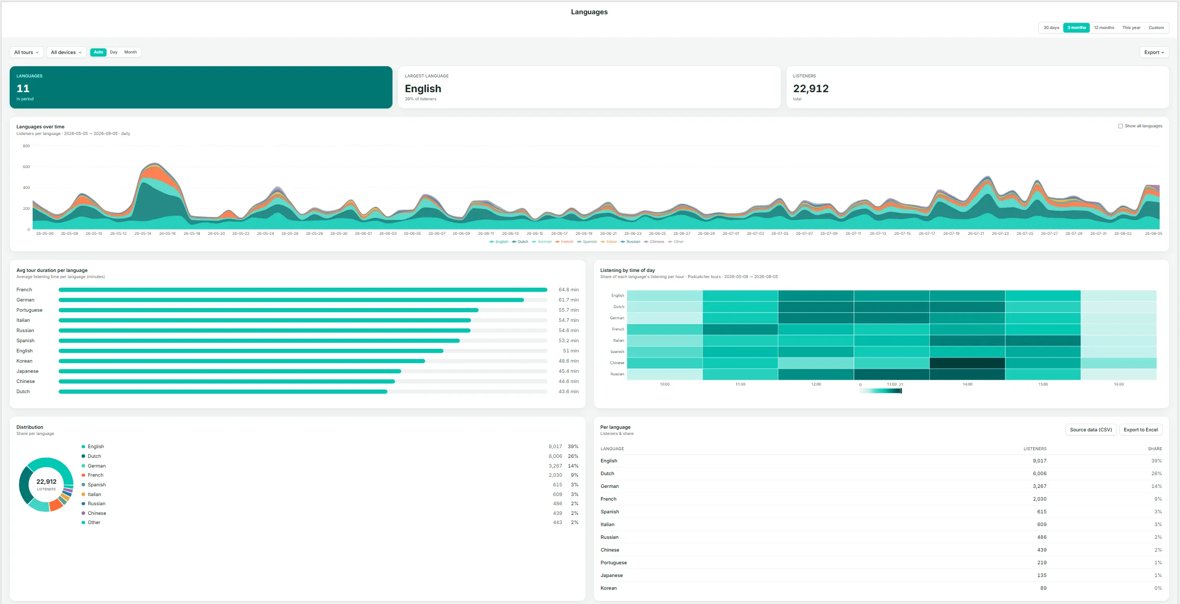
The Languages page gives you a focused view of which languages your visitors listen in, and how that mix is trending over time — the detail behind findings such as a language growing in share, as surfaced on the Vue d'ensemble page.
Key Metrics
Languages — the number of distinct languages used during the period.
Largest language — the single largest language by listener share, with its percentage.
Listeners — total listeners in the current selection.
Languages Over Time
A stacked area chart of listeners by language across the date range. By default, smaller languages are grouped together; select Show all languages to display every language individually.
Avg Tour Duration Per Language
A bar chart ranking languages by average time spent. Notable differences here can indicate translation or narration-pacing issues — for example, if one language runs noticeably longer or shorter than the rest, it may be worth reviewing that recording.
Listening by Time of Day
A heatmap showing each language’s share of listening by hour, useful for identifying whether evening visitors, for instance, skew toward a different language mix than daytime visitors.
Distribution
A donut chart breakdown of listener share by language.
Per Language Table
Listeners and share for every language, with Source data (CSV) et Export to Excel options.
If a language’s share is growing, use the Les visites guidées page to check whether that growth is concentrated in one tour or spread across your whole catalog before deciding where to expand coverage.
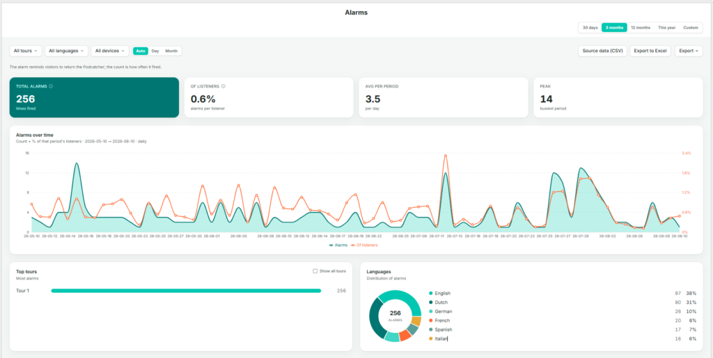
The Alarms page tracks the “return the Podcatcher” reminder alarm — how often it fires, and for what share of listeners. This is primarily an operations and hardware-recovery metric rather than a content metric.
As the page itself notes: the alarm reminds visitors to return the Podcatcher; the count is how often it fired.
Key Metrics
Total alarms — the number of times the alarm fired during the selection.
Of listeners — alarms as a percentage of total listeners, indicating how often a session ends in a reminder alarm rather than a standard return.
Avg per period — the average number of alarms per day, or per the selected granularity.
Peak — the busiest single period for alarms within the selection.
Alarms Over Time
A dual-axis daily chart showing alarm count (area) alongside the percentage of that period’s listeners (line), making it possible to see whether alarm counts are rising because of higher visitor numbers or because a larger share of visitors are forgetting to return devices.
Top Tours
The tours generating the most alarms, ranked, with Show all tours to expand the list.
Languages
A donut chart and list of alarm share by language, useful for identifying whether one language group tends to forget devices more often, which may point to unclear instructions or a translation gap rather than a behavioral difference.
Use Source data (CSV) ou Export to Excel on this page to share alarm trends with your hardware or operations team, particularly ahead of busy periods where late returns can cause delays at handback.
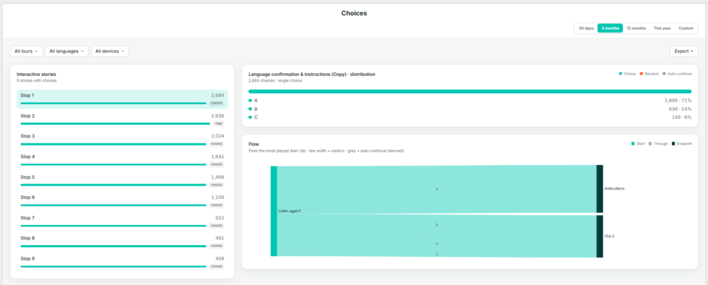
The Choices page shows how visitors navigate interactive, branching stories — those where a listener selects a direction or option rather than the tour continuing automatically to the next stop.
Interactive Stories
A list of every story in your account that includes at least one choice point, ranked by number of choices made and tagged CHOICE. Select a story from this list to view its distribution and flow below.
Distribution
For the selected interactive story, this shows a breakdown of every option chosen and how often — for example, Left, Up, Right, Down — each with a count and share. The legend distinguishes three types of navigation:
Choice — the visitor actively selected this option.
Random — the system selected on the visitor’s behalf, for example when no input was given.
Auto-continue — the tour advanced automatically because there was no choice to make. This is a derived path rather than a genuine branch.
Flow
A flow diagram tracing visitors from the most-played starting clip through to their eventual destination. Line width represents the number of visitors; grey lines represent auto-continue paths. This view is the most effective way to identify whether one branch is significantly more popular than others, or whether a branch is being bypassed via auto-continue rather than genuinely avoided.
Before drawing conclusions from the Distribution chart, check the legend to confirm how much of the total was Choice versus Random or Auto-continue — a branch can look popular simply because it’s the system default.
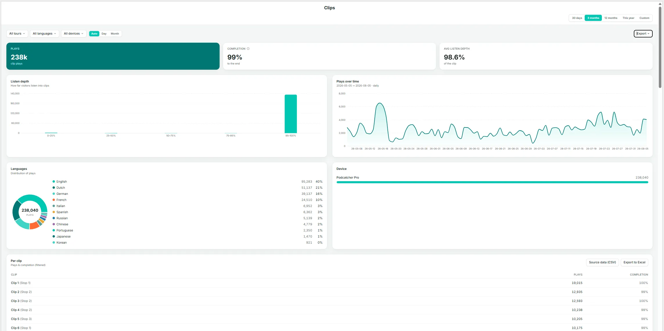
The Clips page is the most granular level of detail within Insights. A story can consist of several clips — for example, an introduction, a choice point, and a follow-up — and this page shows how much of each individual clip is actually heard.
Key Metrics
Plays — total clip plays in the current selection.
Completion — the percentage of plays that reached the end of the clip.
Avg listen depth — the average distance listeners get into a clip, expressed as a percentage across all plays — a more granular companion to Completion.
Listen Depth
A histogram grouping plays by how far they progressed (0–25%, 25–50%, 50–75%, 75–95%, 95–100%). A well-performing clip should show most plays in the 95–100% band; a large share of early drop-off in another band indicates a clip worth reviewing for length, pacing, or content.
Plays Over Time
Daily play volume for clips in the current selection.
Languages
A donut chart and list of play share by language.
Device
A breakdown by device type.
Per Clip Table
Clip name (shown with its parent story in parentheses), plays, and completion rate, with Source data (CSV) et Export to Excel options.
Listen Depth Per Clip
A stacked bar per clip, ordered by volume, showing the share of plays in each depth band (darker shading indicates a more complete listen). Select Show all clips to view beyond the default set.
Other devices (App, Mobile Website) log a finished yes/no, which is counted into the 95–100% band (yes) or the 50–75% band (no) on this chart — keep this in mind if your audience skews toward non-Podcatcher devices.
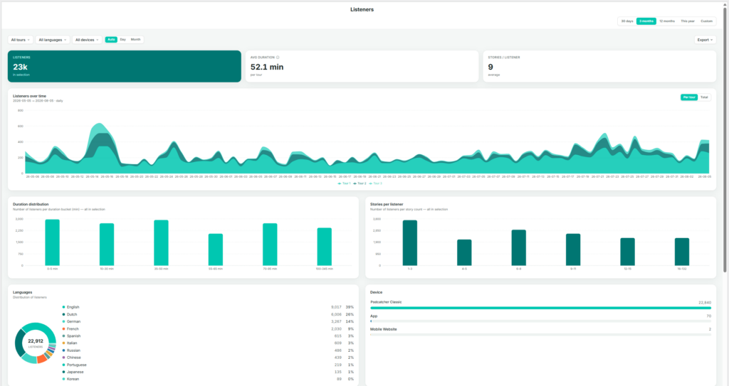
The Tours page shows listener behavior on a per-tour basis — who is listening, for how long, and when. The page itself is titled Listeners, since every chart is built from listener sessions grouped by tour.
Key Metrics
Listeners — total listeners in the current selection (with any tour, language, or device filters applied).
Avg duration — average time spent per tour, within the current selection.
Stories / listener — average number of stories played per listener.
Listeners Over Time
Listener volume stacked by tour, showing each tour’s contribution to the total by day. Toggle between Per tour (stacked view) and Total (combined line).
Duration Distribution
A bar chart grouping listeners by how long they spent (for example, 0–5 min, 10–30 min, 35–45 min, up to 100+ min). Useful for identifying whether most visitors complete the full tour or leave early.
Stories Per Listener
A bar chart grouping listeners by how many stories they played (1–2, 3–5, 6–7, and so on). This complements the duration chart: a listener spending a long time but playing few stories may be lingering rather than progressing through the tour.
Languages
A donut chart and list, matching the format on the Languages page but scoped to the current tour and date filters.
Device
A breakdown by Podcatcher classis, App, and Mobile Website.
Listeners by Weekday × Hour
A heatmap showing when listening activity occurs, with darker cells indicating busier periods. Useful for planning staffing, hardware allocation, or maintenance windows during quieter times.
Avg Tour Duration Per Weekday
A bar chart comparing average duration by day of the week — for example, to check whether weekend visitors spend more time than weekday visitors.
Per Tour Table
Listeners, average duration, and stories per listener broken out by individual tour, with Source data (CSV) et Export to Excel options.
Use the All tours, All languages, and All devices filters at the top of the page to isolate a single tour before reading the charts — every chart and table on the page reflects these filters.
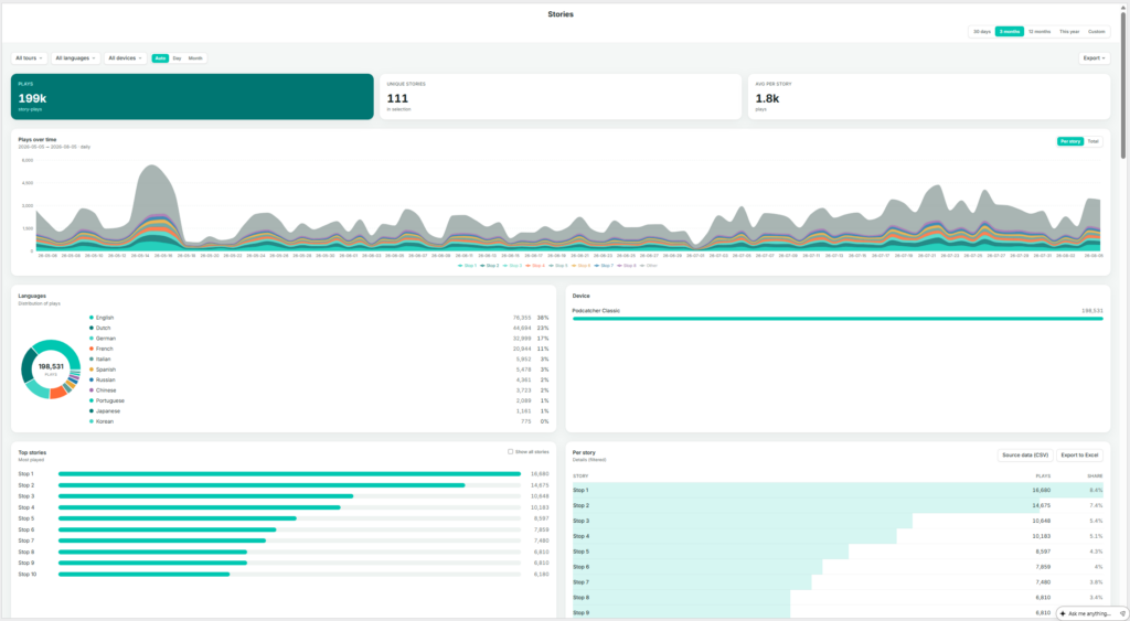
The Stops page shows which individual stories (stops) are played, how often, and when. The sidebar labels this page Arrêts; the page itself is titled Stories — a stop on a tour is the point at which a story plays, so the two terms describe the same thing from different angles: the physical location versus the audio content delivered there.
Key Metrics
Plays — total story-plays in the current selection (one listener playing one story once counts as one play).
Unique stories — the number of distinct stories played at least once in the selection.
Avg per story — average plays per story (total plays divided by unique stories).
Plays Over Time
Play volume stacked by story, toggling between Per story et Total. With a large number of stories, the chart displays the top contributors alongside an “Other” category.
Languages
A donut chart and list showing play share by language.
Device
A breakdown by Podcatcher Pro, App, and Mobile Website.
Top Stories
A ranked list of the most-played stories. Select Show all stories to expand beyond the default view.
Per Story Table
Story name, plays, and share, sortable and exportable via Source data (CSV) et Export to Excel.
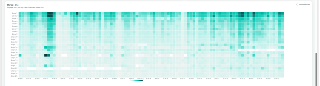
Stories × Time
A heatmap of plays per story per day, showing the busiest stories by default (also expandable with Show all stories). This view is useful for spotting a story that suddenly spikes or goes quiet, which more often points to a technical issue — such as a broken trigger point — than a genuine change in visitor interest.
If a story’s plays drop suddenly, check the Stories × time heatmap first to pinpoint exactly when it happened — it usually narrows the cause down to a specific day rather than a gradual decline.
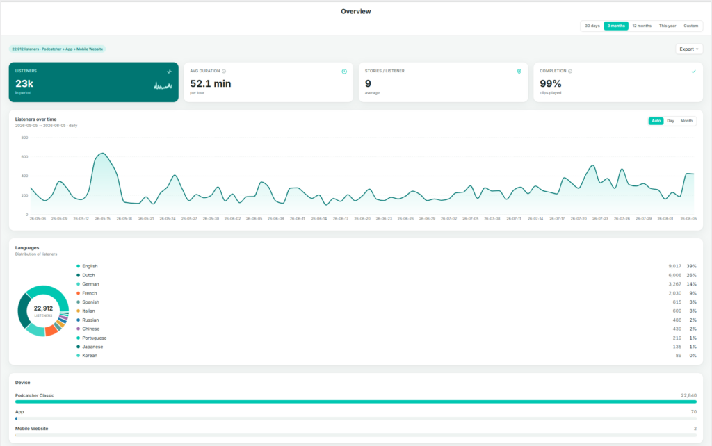
When you and your visitors use the tours you have created on the platform, the system automatically collects performance data. The Overview page brings the most important of these metrics together in one place, so you can judge overall performance before deciding whether any other Insights page is worth exploring in more detail.
Finding the Overview page
After logging in to the platform, you are taken directly to the Insights → Overview page. If you navigate elsewhere, you can return by selecting Insights in the sidebar, then Vue d'ensemble.
What This Page Shows
The Overview page brings together a set of graphs and figures that summarize how your tours are performing as a whole:
Key metrics — listeners, average duration, stories per listener, and completion
Listeners over time
Language distribution
Device breakdown
Key Metrics
Listeners — the total number of people who used a tour during the selected period.
Avg duration — the average time spent per tour.
Stories / listener — the average number of stories (stops) a listener plays per visit. A useful indicator of engagement depth.
Completion — the percentage of clips played through to the end. A high completion rate generally indicates that content length and pacing are working well.
Listeners Over Time
A daily or monthly chart of listener volume across the selected date range. Use the Auto / Day / Month toggle to adjust the granularity.
Languages
A donut chart and ranked list showing listener share by language. This is a condensed view of the full Languages page.
Device
A breakdown of the devices visitors used: Podcatcher Pro (dedicated hardware), Appou Site web mobile. For most venues, Podcatcher Pro accounts for the large majority of usage.
By checking the Overview page regularly, you can catch emerging trends early and decide with confidence where in Insights to focus your attention next.
The summary line above the metrics (for example, “22,776 listeners · Podcatcher + App + Mobile Website”) shows which channels are included in the figures below — useful context before comparing periods.
Actionable Insights transforme les données de votre système Podcatcher Pro en recommandations opportunes qui vous aident à prévenir les perturbations et à optimiser l'expérience des visiteurs. Ce système de notification intelligent vous tient informé de l'état du matériel et des performances de la tournée, ce qui vous permet de résoudre les problèmes potentiels avant qu'ils n'affectent vos invités.
Référence rapide
Accéder au centre de messagerie : Tableau de bord → icône Centre de messages
Configuration du courrier électronique : Profil → Préférences de messagerie
Niveaux de notification : Mineure, modérée, grave (classée par ordre d'urgence)
Principaux avantages : Maintenance proactive, réduction des temps d'arrêt, optimisation du flux de visiteurs
Caractéristiques principales : Surveillance du matériel, informations sur les performances des tournées, alertes par courrier électronique
Comment fonctionne Actionable Insights
Le système Actionable Insights surveille en permanence votre environnement Podcatcher Pro, en analysant à la fois l'état du matériel et les interactions avec les visiteurs afin d'identifier les possibilités d'amélioration. Lorsque le système détecte un problème ou une opportunité d'optimisation, il génère une notification avec une recommandation d'action claire.
Système de notification
Actionable Insights classe les notifications par priorité pour vous aider à vous concentrer sur ce qui compte le plus :
Notifications mineures (informatives)
Mises à jour informatives ne nécessitant pas d'action immédiate
Exemples : mises à jour du système disponibles, arrêts de visite peu fréquentés
Utile pour la planification et l'optimisation à long terme
Notifications modérées (demande de l'attention)
Questions à traiter pour maintenir une performance optimale
Notifications graves (nécessitant une action immédiate)
Questions critiques nécessitant une attention immédiate
Exemples : camps de base hors ligne, Podcatchers en état d'erreur
Essentiel pour éviter de perturber l'expérience des visiteurs
Utilisation du centre de messagerie
Le centre de messages est le point central de toutes les notifications. Il fournit des informations claires sur chaque problème et les solutions recommandées.
Accès au centre de messages
Se connecter à la plateforme Guide-ID
Recherchez l'en-tête Message Center dans la barre supérieure gauche.
Cliquez sur pour ouvrir votre tableau de bord de notification
Comprendre les alertes du centre de messagerie
Chaque notification dans le centre de messages comprend
Icône d'alerte indiquant le niveau de priorité
Description claire du problème détecté
Recommandation réalisable pour résoudre le problème
Horodatage indiquant la date à laquelle le problème a été détecté
For example, a typical notification might alert you that “IDentifier with serial number BP.000.433 is low on battery” and recommend that you “Please replace or recharge the battery to keep using this IDentifier.”
Remarque : Pour une référence complète de toutes les notifications possibles et des actions recommandées, voir [Types de notifications et recommandations].
Gestion des notifications
Le Centre de messages vous permet de
Examiner toutes les notifications actives en un seul endroit pratique
Annuler les notifications une fois que vous les avez abordés
Suivi de l'état de la résolution car le système supprime automatiquement les problèmes corrigés
Considérations sur l'accessibilité Le centre de messages est conçu pour présenter des informations critiques d'un seul coup d'œil, ce qui le rend très utile dans les musées très fréquentés, où le personnel n'a que quelques instants entre les interactions avec les visiteurs pour vérifier l'état du système.
Système de notification par courrier électronique
Pour que vous ne manquiez jamais les alertes importantes, Actionable Insights va au-delà de la plateforme avec des notifications stratégiques par e-mail.
Types d'alertes par courrier électronique
Emails hebdomadaires de synthèse
Vue d'ensemble de toutes les notifications en cours
Priorité au niveau d'urgence
Fournit un moyen pratique de rester informé même lorsque l'on n'est pas connecté à la plateforme
Emails d'alerte urgents
Envoyé lorsque des problèmes critiques nécessitent une attention immédiate
Se concentrer spécifiquement sur les notifications graves
Personnalisation des préférences en matière de courrier électronique
Vous pouvez adapter votre expérience de notification aux besoins de votre musée :
Naviguez vers Profil -> Préférences de messagerie dans la plateforme Guide-ID
Sélectionnez Préférences de notification
Choisissez les types d'e-mails que vous souhaitez envoyer.
Sauvegarder vos paramètres
Principales capacités de surveillance
Actionable Insights surveille deux aspects principaux de votre expérience muséale :
1. Surveillance de l'état du matériel
Le système suit de manière proactive l'état de votre matériel Guide-ID, y compris :
IDentifier Niveaux de batterie
Alertes lorsque les piles atteignent des seuils bas
Permet d'éviter les interruptions de la visite audio dans des zones d'exposition spécifiques
Permet une maintenance planifiée plutôt que des interventions d'urgence
Statut de l'appareil Podcatcher
Identifie les appareils manquants pour maintenir l'inventaire
Détecte les Podcatchers en état d'erreur
Moniteurs Connectivité du dispositif de synchronisation
2. Analyse des performances des tournées
Au-delà du matériel, Actionable Insights permet d'optimiser l'expérience du contenu :
Analyse des schémas d'utilisation
Identifie les arrêts de visite sous-utilisés ou très populaires
Vous aide à comprendre les schémas d'engagement des visiteurs
Fournit des informations pour l'amélioration du contenu
Résolution des problèmes Informations exploitables
Si vous rencontrez des problèmes avec le système Actionable Insights, essayez ces solutions simples :
Enjeu
Solution
Ne pas recevoir de notifications par courrier électronique
Vérifiez votre dossier spam et vérifiez que votre adresse e-mail est correcte dans les paramètres de l'utilisateur.
Absence de notifications attendues
Confirmez que vos préférences de notification sont correctement configurées et que vous n'avez pas rejeté le message.
La notification d'abandon réapparaît
Le problème sous-jacent peut ne pas être entièrement résolu
Avertissement If you dismiss multiple IDentifier battery warnings without replacing batteries, you risk unexpected audio tour disruptions for your visitors. Always follow recommended actions when possible.
Indicateurs de réussite
Vous saurez que vous utilisez efficacement Actionable Insights lorsque.. :
Les problèmes matériels évitables diminuent dans votre musée
Le personnel peut traiter les problèmes potentiels avant qu'ils n'affectent les visiteurs
Votre processus de remplacement de la batterie devient proactif plutôt que réactif
Diminution du nombre d'incidents liés à la disparition de Podcatcher
Pour toute assistance supplémentaire concernant Actionable Insights, contactez le service d'assistance de Guide-ID via le centre d'aide de la plateforme ou envoyez un courrier électronique à l'adresse suivante Helpdesk@guide-id.com.
Download your tour metrics as CSV files for external processing and deeper insights
The Export feature lets you download comprehensive tour analytics data for custom analysis in your preferred tools. Follow these simple steps to access your valuable visitor engagement metrics.
Référence rapide
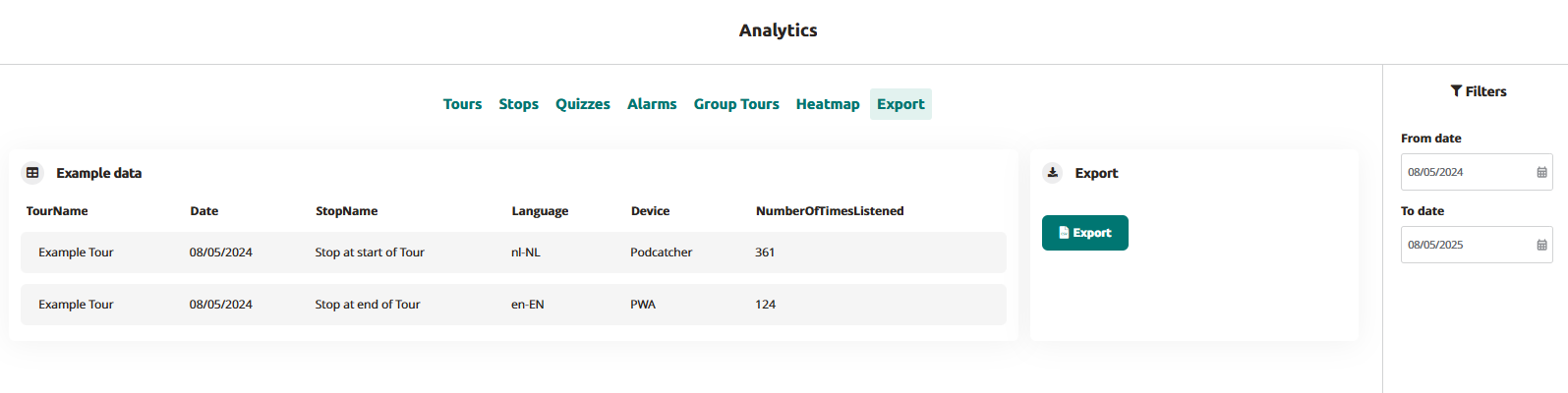
Navigate to Analytics → Export in the main menu
Set your desired date range using the From/To date selectors
Click the “Export” button to generate your data file
Download the CSV file when processing is complete
Files are named automatically with your site name and date range
Use it in your data platform
Accessing the Export Function
Se connecter à la plateforme Guide-ID
Select “Analytics” from the left navigation menu
Click the “Export” tab in the top menu bar
Setting Export Parameters
Use the date filters in the right sidebar:
Click “From date” to select your starting date
Click “To date” to select your ending date
Generating Your Export
Click the blue “Export” button
Wait briefly while the processing indicator shows your file is being prepared
When complete, the file will automatically download to your device
Files are named “SiteName-Analytics-YYYYMMDD-YYYYMMDD.csv”
Understanding Your Data
Your exported CSV file will contain the following data columns:
TourName: The name of the tour as configured in the platform
Date: The date when the visitor interaction occurred (YYYY-MM-DD format)
StopName: The specific audio stop or IDentifier point
Language: The language code selected by the visitor (e.g., en-EN, nl-NL)
Device: The playback device type (Podcatcher or PWA for web app)
NumberOfTimesListened: Total play count for each stop
Troubleshooting Export Issues
Enjeu
Solution
CSV file shows incorrect formatting
Open in a dedicated spreadsheet program rather than a text editor
Missing data for specific tours
Check that the tours were active during your selected date range
By exporting your Guide-ID analytics data, you gain the flexibility to perform deeper analysis beyond the platform’s built-in visualizations. This direct access to your visitor engagement metrics empowers data-driven decisions about content development, tour optimization, and resource allocation.
When you and your visitors use the tours you have created on the Guide-ID Platform, the system automatically collects analytics data.
These metrics are invaluable for evaluating the performance of your tours, stops, and clips, as well as analyzing user engagement with quizzes and surveys.
Finding the analytics page
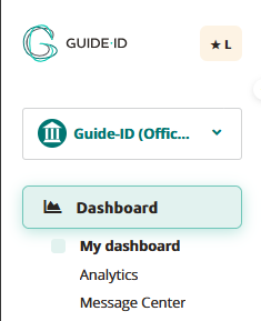
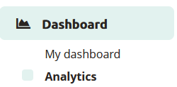
Upon logging in to the Guide-ID Platform, you will land on the Dashboard. To navigate to the Analytics page, simply locate it in the sidebar below the Dashboard section.
Les visites guidées
Within the tours tab, you will find a collection of informative graphs that provide key details about your tours. These include the number of tours played, the total number of stories shared, the duration of each tour, and the average number of stops visited per tour.
Arrêts
The stops tab offers valuable insights into the most and least played stops, as well as the triggers that prompted their playback. Popular stops typically indicate visitor preferences, while less frequented stops may be situated in less accessible areas or encountered when visitors are fatigued from the tour through the museum.
Clips
This section provides information on the chosen options and how they compare to alternative choices, offering valuable insights into visitor preferences.
Alarms
In the alarms tab, you can monitor the frequency at which alarms were triggered and identify the most commonly activated alarm (if multiple alarms are set up).
Group tours
This is subscription based for Podcatcher Pro clients. For questions please contact our Helpdesk or one of our Business Managers
Heatmap
This section provides information about visitor counts and percentages for the selected tour stops. You can select a month and year and then choose a specific tour.
The stops for the selected tour are displayed in a table, organized by day.
The table shows listening rates as percentages. To switch between percentage values and visitor counts, click the Toggle Visitor Count/Percentage button.
The color of the table cells varies based on the listening percentages
Export
From the Export tab, you can download analytics data about stops yourself, to be used to create your own displays or to combine with data from other analytics platforms you use for your museum. See our Exporting Analytics Data pour plus d'informations.



 Les visites guidées


 Français
  English
  Nederlands