Insights: Languages

The Languages page gives you a focused view of which languages your visitors listen in, and how that mix is trending over time — the detail behind findings such as a language growing in share, as surfaced on the Overzicht pagina.
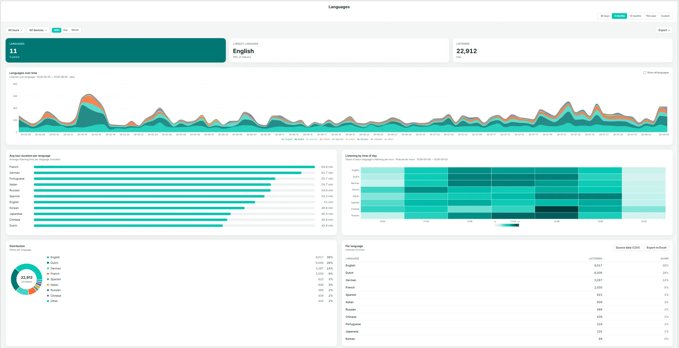
The Insights → Languages page — key metrics, languages over time, avg tour duration per language, and listening by time of day.

Key Metrics

  • Languages — the number of distinct languages used during the period.
  • Largest language — the single largest language by listener share, with its percentage.
  • Listeners — total listeners in the current selection.

Languages Over Time

A stacked area chart of listeners by language across the date range. By default, smaller languages are grouped together; select Show all languages to display every language individually.

Avg Tour Duration Per Language

A bar chart ranking languages by average time spent. Notable differences here can indicate translation or narration-pacing issues — for example, if one language runs noticeably longer or shorter than the rest, it may be worth reviewing that recording.

Listening by Time of Day

A heatmap showing each language’s share of listening by hour, useful for identifying whether evening visitors, for instance, skew toward a different language mix than daytime visitors.

Distribution

A donut chart breakdown of listener share by language.

Per Language Table

Listeners and share for every language, with Source data (CSV) en Export to Excel options.

If a language’s share is growing, use the Tours page to check whether that growth is concentrated in one tour or spread across your whole catalog before deciding where to expand coverage.
Insights: Alarms

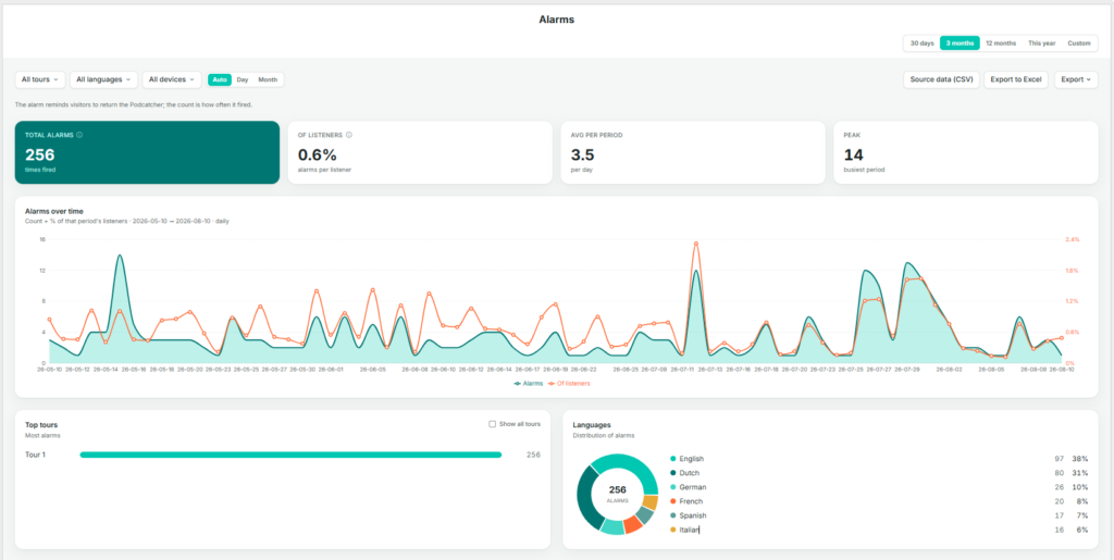
The Alarms page tracks the “return the Podcatcher” reminder alarm — how often it fires, and for what share of listeners. This is primarily an operations and hardware-recovery metric rather than a content metric.

As the page itself notes: the alarm reminds visitors to return the Podcatcher; the count is how often it fired.

Key Metrics

  • Total alarms — the number of times the alarm fired during the selection.
  • Of listeners — alarms as a percentage of total listeners, indicating how often a session ends in a reminder alarm rather than a standard return.
  • Avg per period — the average number of alarms per day, or per the selected granularity.
  • Peak — the busiest single period for alarms within the selection.

Alarms Over Time

A dual-axis daily chart showing alarm count (area) alongside the percentage of that period’s listeners (line), making it possible to see whether alarm counts are rising because of higher visitor numbers or because a larger share of visitors are forgetting to return devices.

Top Tours

The tours generating the most alarms, ranked, with Show all tours to expand the list.

Languages

A donut chart and list of alarm share by language, useful for identifying whether one language group tends to forget devices more often, which may point to unclear instructions or a translation gap rather than a behavioral difference.

Use Source data (CSV) of Export to Excel on this page to share alarm trends with your hardware or operations team, particularly ahead of busy periods where late returns can cause delays at handback.

Insights: Choices

The Choices page shows how visitors navigate interactive, branching stories — those where a listener selects a direction or option rather than the tour continuing automatically to the next stop.

Interactive Stories

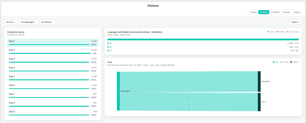
A list of every story in your account that includes at least one choice point, ranked by number of choices made and tagged CHOICE. Select a story from this list to view its distribution and flow below.

Distribution

For the selected interactive story, this shows a breakdown of every option chosen and how often — for example, LeftUpRightDown — each with a count and share. The legend distinguishes three types of navigation:

  • Choice — the visitor actively selected this option.
  • Random — the system selected on the visitor’s behalf, for example when no input was given.
  • Auto-continue — the tour advanced automatically because there was no choice to make. This is a derived path rather than a genuine branch.

Flow

A flow diagram tracing visitors from the most-played starting clip through to their eventual destination. Line width represents the number of visitors; grey lines represent auto-continue paths. This view is the most effective way to identify whether one branch is significantly more popular than others, or whether a branch is being bypassed via auto-continue rather than genuinely avoided.

Before drawing conclusions from the Distribution chart, check the legend to confirm how much of the total was Choice versus Random or Auto-continue — a branch can look popular simply because it’s the system default.

Insights: Clips

2 minreadUpdatedAug 2026

The Clips page is the most granular level of detail within Insights. A story can consist of several clips — for example, an introduction, a choice point, and a follow-up — and this page shows how much of each individual clip is actually heard.

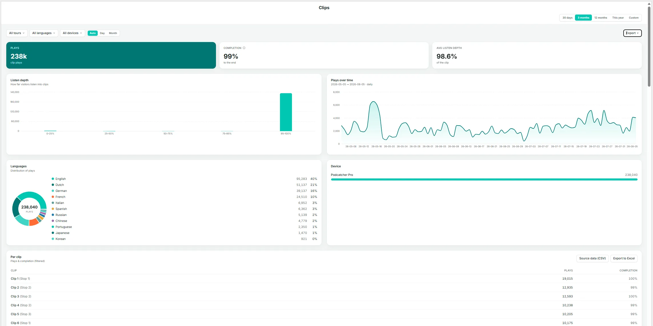
The Insights → Clips page — key metrics, plays over time, languages, and device.
The Insights → Clips page — listen depth.

Key Metrics

  • Plays — total clip plays in the current selection.
  • Completion — the percentage of plays that reached the end of the clip.
  • Avg listen depth — the average distance listeners get into a clip, expressed as a percentage across all plays — a more granular companion to Completion.

Listen Depth

A histogram grouping plays by how far they progressed (0–25%, 25–50%, 50–75%, 75–95%, 95–100%). A well-performing clip should show most plays in the 95–100% band; a large share of early drop-off in another band indicates a clip worth reviewing for length, pacing, or content.

Plays Over Time

Daily play volume for clips in the current selection.

Languages

A donut chart and list of play share by language.

Apparaat

A breakdown by device type.

Per Clip Table

Clip name (shown with its parent story in parentheses), plays, and completion rate, with Source data (CSV) en Export to Excel options.

Listen Depth Per Clip

A stacked bar per clip, ordered by volume, showing the share of plays in each depth band (darker shading indicates a more complete listen). Select Show all clips to view beyond the default set.

Other devices (App, Mobile Website) log a finished yes/no, which is counted into the 95–100% band (yes) or the 50–75% band (no) on this chart — keep this in mind if your audience skews toward non-Podcatcher devices.

Insights: Tours Statistics

The Tours page shows listener behavior on a per-tour basis — who is listening, for how long, and when. The page itself is titled Listeners, since every chart is built from listener sessions grouped by tour.

Key Metrics

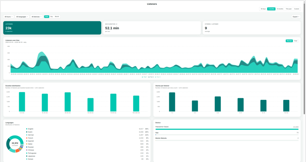
  • Listeners — total listeners in the current selection (with any tour, language, or device filters applied).
  • Avg duration — average time spent per tour, within the current selection.
  • Stories / listener — average number of stories played per listener.

Listeners Over Time

Listener volume stacked by tour, showing each tour’s contribution to the total by day. Toggle between Per tour (stacked view) and Total (combined line).

Duration Distribution

A bar chart grouping listeners by how long they spent (for example, 0–5 min, 10–30 min, 35–45 min, up to 100+ min). Useful for identifying whether most visitors complete the full tour or leave early.

Stories Per Listener

A bar chart grouping listeners by how many stories they played (1–2, 3–5, 6–7, and so on). This complements the duration chart: a listener spending a long time but playing few stories may be lingering rather than progressing through the tour.

Languages

A donut chart and list, matching the format on the Languages page but scoped to the current tour and date filters.

Apparaat

A breakdown by Podcatcher classis, App, and Mobile Website.

Listeners by Weekday × Hour

A heatmap showing when listening activity occurs, with darker cells indicating busier periods. Useful for planning staffing, hardware allocation, or maintenance windows during quieter times.

Avg Tour Duration Per Weekday

A bar chart comparing average duration by day of the week — for example, to check whether weekend visitors spend more time than weekday visitors.

Per Tour Table

Listeners, average duration, and stories per listener broken out by individual tour, with Source data (CSV) en Export to Excel options.

Use the All toursAll languages, and All devices filters at the top of the page to isolate a single tour before reading the charts — every chart and table on the page reflects these filters.

Insights: Stop

2 minreadUpdatedAug 2026

The Stops page shows which individual stories (stops) are played, how often, and when. The sidebar labels this page Stops; the page itself is titled Stories — a stop on a tour is the point at which a story plays, so the two terms describe the same thing from different angles: the physical location versus the audio content delivered there.

Key Metrics

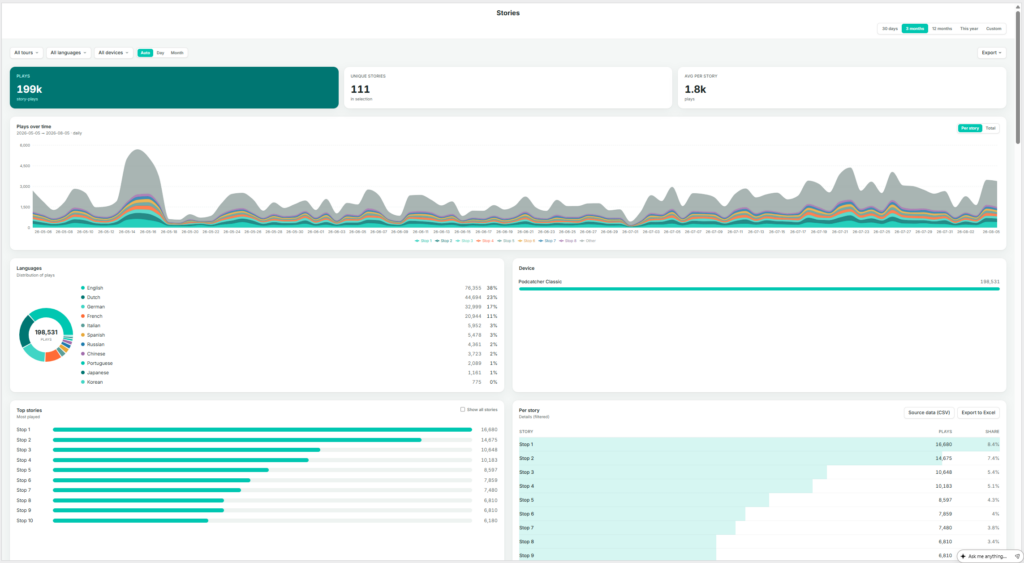
  • Plays — total story-plays in the current selection (one listener playing one story once counts as one play).
  • Unique stories — the number of distinct stories played at least once in the selection.
  • Avg per story — average plays per story (total plays divided by unique stories).

Plays Over Time

Play volume stacked by story, toggling between Per story en Total. With a large number of stories, the chart displays the top contributors alongside an “Other” category.

Languages

A donut chart and list showing play share by language.

Apparaat

A breakdown by Podcatcher Pro, App, and Mobile Website.

Top Stories

A ranked list of the most-played stories. Select Show all stories to expand beyond the default view.

Per Story Table

Story name, plays, and share, sortable and exportable via Source data (CSV) en Export to Excel.

Stories × Time

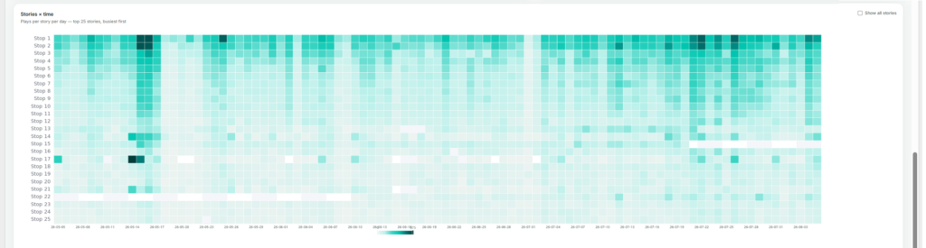
A heatmap of plays per story per day, showing the busiest stories by default (also expandable with Show all stories). This view is useful for spotting a story that suddenly spikes or goes quiet, which more often points to a technical issue — such as a broken trigger point — than a genuine change in visitor interest.

If a story’s plays drop suddenly, check the Stories × time heatmap first to pinpoint exactly when it happened — it usually narrows the cause down to a specific day rather than a gradual decline.

Insights Overview

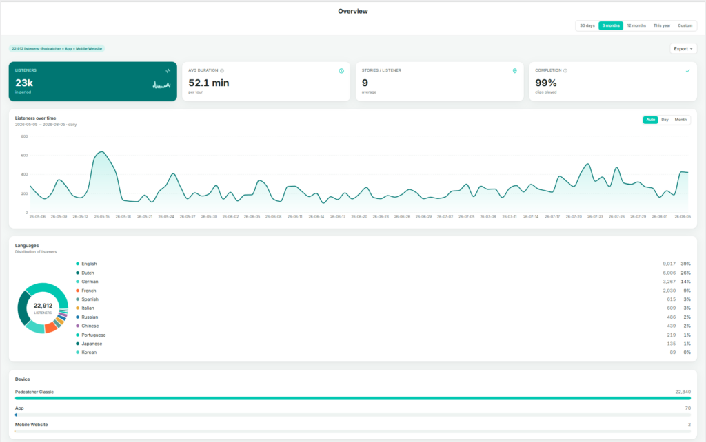
When you and your visitors use the tours you have created on the platform, the system automatically collects performance data. The Overview page brings the most important of these metrics together in one place, so you can judge overall performance before deciding whether any other Insights page is worth exploring in more detail.

Finding the Overview page

After logging in to the platform, you are taken directly to the Insights → Overview page. If you navigate elsewhere, you can return by selecting Insights in the sidebar, then Overzicht.

What This Page Shows

The Overview page brings together a set of graphs and figures that summarize how your tours are performing as a whole:

  • Key metrics — listeners, average duration, stories per listener, and completion
  • Listeners over time
  • Language distribution
  • Device breakdown

Key Metrics

  • Listeners — the total number of people who used a tour during the selected period.
  • Avg duration — the average time spent per tour.
  • Stories / listener — the average number of stories (stops) a listener plays per visit. A useful indicator of engagement depth.
  • Completion — the percentage of clips played through to the end. A high completion rate generally indicates that content length and pacing are working well.

Listeners Over Time

A daily or monthly chart of listener volume across the selected date range. Use the Auto / Day / Month toggle to adjust the granularity.

Languages

A donut chart and ranked list showing listener share by language. This is a condensed view of the full Languages pagina.

Apparaat

A breakdown of the devices visitors used: Podcatcher Pro (dedicated hardware), de Appof Mobiele Website. For most venues, Podcatcher Pro accounts for the large majority of usage.

By checking the Overview page regularly, you can catch emerging trends early and decide with confidence where in Insights to focus your attention next.

The summary line above the metrics (for example, “22,776 listeners · Podcatcher + App + Mobile Website”) shows which channels are included in the figures below — useful context before comparing periods.