NOTE: This page is only available if your Site is using a MapMyVisit console!
This report shows you how your tour is doing on MapMyVisit. It compares the total number of tours to the number of people that left their e-mail address and how many visitors clicked the link sent to them. You may find this useful if you want to get insight into how many people use the MapMyVisit console, and who may be interested in any offers you may have for them.
As with other Analytics views, you can select the period for which you’d like to see the analytical data at the top of the page.
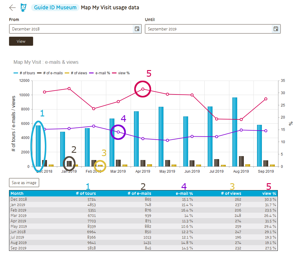
When you’ve selected a period and click “view”, a graph and a table will appear with the data. There are five values in the graph, corresponding to five columns in the table.
The light blue line (1) represents the total number of tours that were recorded on your site in the given month.
The brown bars (2) show the number of MapMyVisit e-mail addresses that were recorded (and messages sent) in the month.
The yellow bars (3) show the number of visitors that ended up viewing the tour on the MapMyVisit website.
The purple line (4) shows the percentage of visitors that entered their e-mail address – the number of e-mails sent versus the number of tours done.
Finally, the pink line (5) represents the percentage of visitors of that entered their e-mail address who then viewed the MapMyVisit page – the number of MapMyVisit views for your tours versus the number of e-mails sent.